How I designed
a useful website for the campaign?
Landing page for carQ.pl
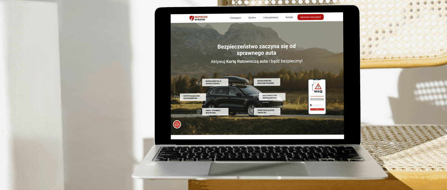
Overview
The goal was to create a page that not only delivers key information intuitively but also engages users to take actions, such as activating the RESQ Electronic Rescue Card.
My main challenge was to combine functionality and accessibility with aesthetics, resulting in a design that is both user-friendly and effective in achieving the campaign’s objectives.
I led the UX research and turned insights into clear user flows, wireframes, and interactive prototypes. I created accessible UI (WCAG) and wrote the product microcopy so screens were simple and consistent. I documented specs and states for developers, collaborated through delivery, and iterated based on feedback.


The what and why
The campaign was created to educate road users about safety and promote the RESQ Electronic Rescue Card.
My task was to design an intuitive and user-friendly landing page that meets WCAG accessibility standards while effectively engaging users.
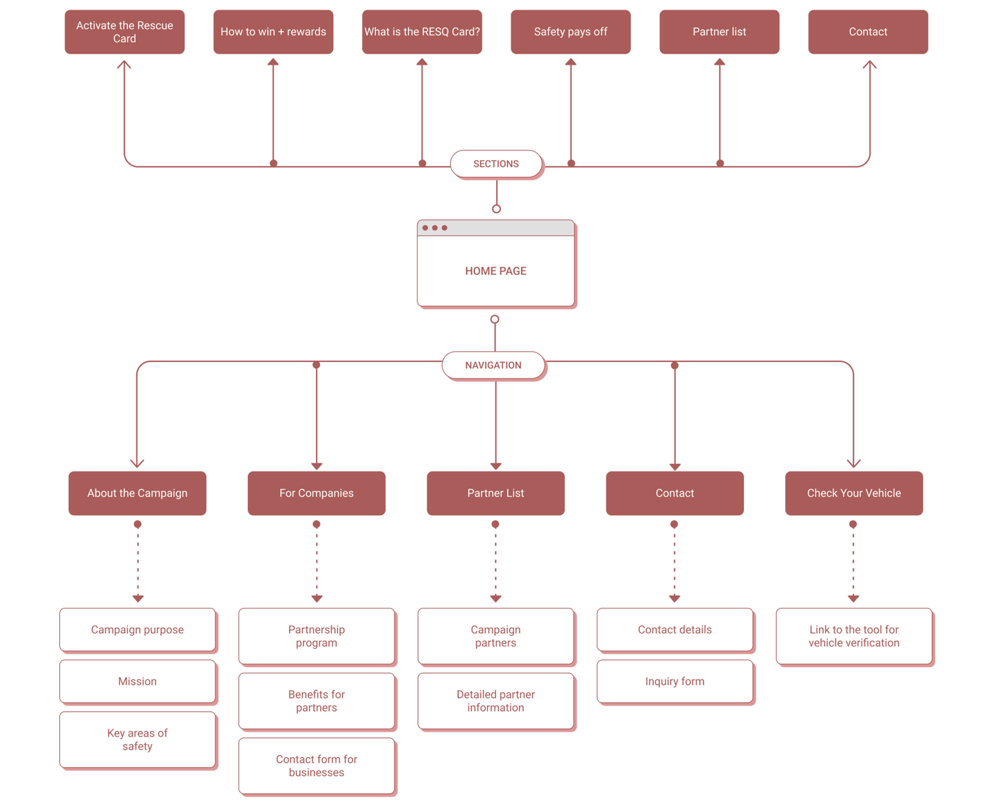
Information Architecture
The campaign was created to educate road users about safety and promote the RESQ Electronic Rescue Card. My task was to design an intuitive and
user-friendly landing page that meets WCAG accessibility standards while effectively engaging users.
Main Section
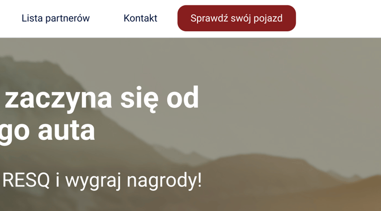
I wanted to increase the visibility and effectiveness of the "Check your vehicle" CTA button, so I suggested enlarging it and positioning it closer to the headline. Users tend to notice centrally placed and easily accessible buttons faster.
01 Home page
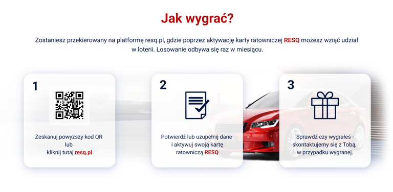
"How to Win?" Section
I added step numbering because I noticed that a clear division of the activation process makes it easier for users to follow. Larger, high-contrast numbering helps users quickly understand the sequence.
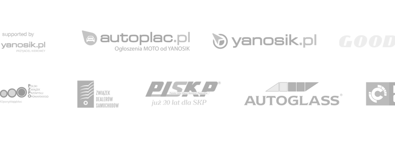

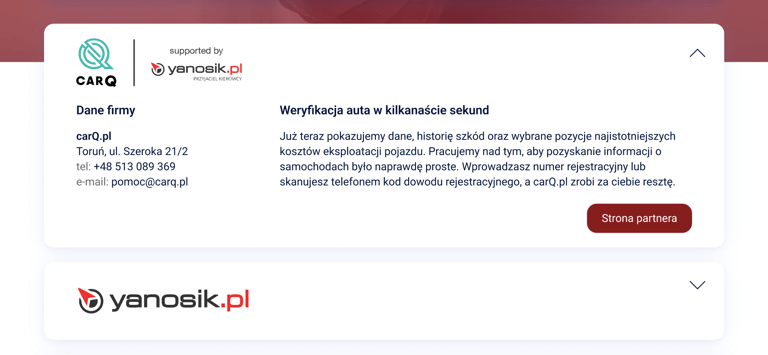
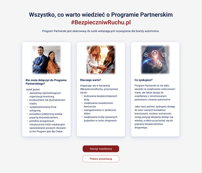
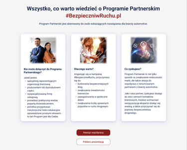
"Meet Our Partners" Section
I wanted to enhance the functionality of this section, so I proposed adding links to partner websites. This allows users to easily find more information about each partner.
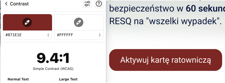
Accessibility
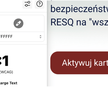
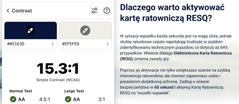
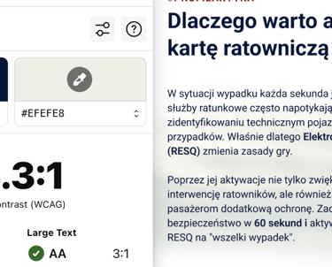
Ensuring the website’s accessibility for all users, including those using screen readers, was a priority for me. I recommended adding alternative descriptive texts for all icons and images to improve their clarity. I also focused on ensuring proper text-to-background contrast to fully meet the WCAG 2.1 standards.
My recommendation
I combined business guidelines with UX requirements to create a useful and accessible website for the campaign.
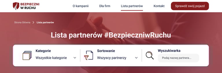

Filters and Sorting
I recommended enhancing the visibility of filters by adding more intuitive icons and brief descriptions of their functions, helping users quickly find relevant partners, such as by location or category. My goal was to make the filtering process faster and more user-friendly.
Expandable Partner Info
I suggested adding visual indicators, such as arrows or icons, in expandable cards to clearly signal that more information is available. This makes the section more interactive and easier for users to understand.


Pagination
To simplify navigation between pages, I suggested adding "Previous" and "Next" buttons next to page numbers. This helps users easily navigate through the partner list, especially when there are multiple pages.
02 Partner list
Building Trust
I wanted users to understand the mission and importance of the campaign. The "About the Campaign" view was designed to build trust by clearly presenting the objectives and actions of the initiative.
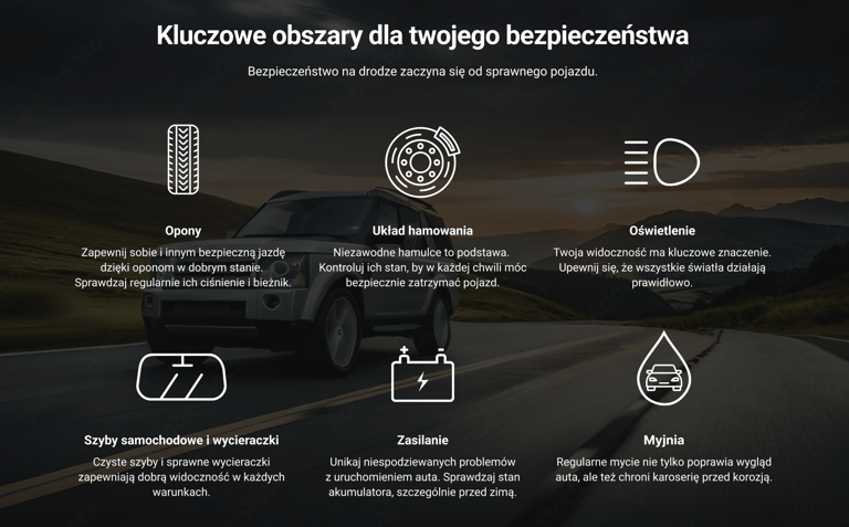
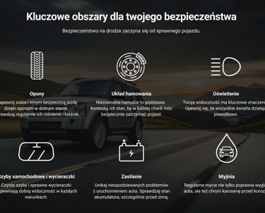
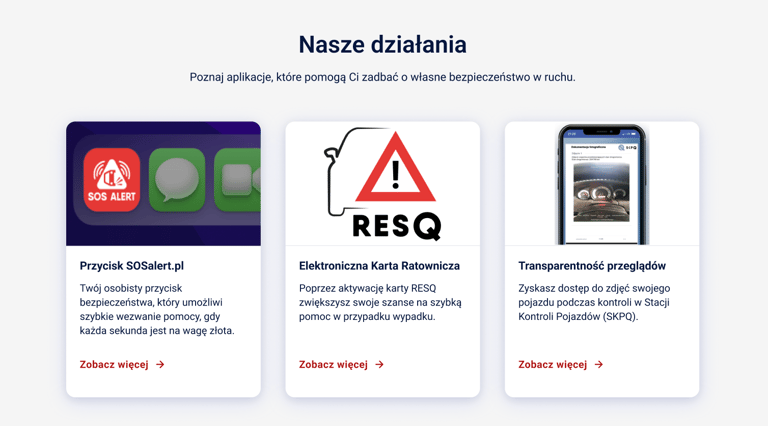
Key Areas of Safety
I emphasized the importance of actions such as tire maintenance and brake system care in enhancing road safety. Icons and concise descriptions make the information both easy to absorb and engaging for users.
Willingness to Collaborate
The "Contact" view was designed as a simple, intuitive form to lower the barrier for users who want to ask questions or establish partnerships. My goal was to make the communication process as straightforward and user-friendly as possible.
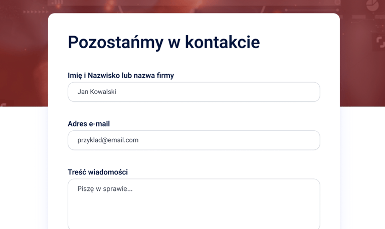
Minimalistic Form Layout
I minimized the number of required fields to allow users to send inquiries quickly. This reduces frustration and the likelihood of form abandonment. I ensured the "Send" button was easy to spot with high contrast and proper placement, encouraging action.
03 About the campaign & contact
The final Outcome of The Project
This project was a fascinating challenge for me, as I had to combine functionality, accessibility, and aesthetics. Working on WCAG compliance taught me how important it is to consider diverse user needs early in the design process.